In my last post I talked about what it means to say that text is legible. If you haven't read it, you might want to take a look before you dive into this one, as some of the maths follows on.
It's pretty obvious that contrast can and does have a significant impact on legibility, and therefore also readability, and not enough of it can make for an unpleasant user experience. To counter this problem there are strict guidelines set out by W3C. If you work in web-based media you'll be familiar with the Web Content Accessibility Guidelines (WCAG), which define minimum contrast values for text in both AA and AAA accessibility standards. WCAG 2.0 level AA requires a minimum contrast ratio of 4.5:1 for normal text and 3:1 for large text.
Level AAA requires a contrast ratio of at least 7:1 for normal text and 4.5:1 for large text.
And the guidelines also state that once contrast reaches 7:1, legibility is unaffected beyond this point. And if that all seems a bit impenetrable, there are many online contrast checking tools available that allow you to test your proposed text foreground and background colours to see if they meet the guidelines.
What is contrast?
In simple terms, contrast in vision is the ability of the eye to distinguish between differing colour and brightness. The values listed above are the ratio of the 'luminance' between the foreground and background colours (though not necessarily in that order). You can think of luminance in this context as a measure of the intensity of light as perceived by the human eye. Some wavelengths (i.e. colours) of light have more luminance than others, peaking in the green-yellow part of the spectrum.
The process by which contrast ratios are calculated probably isn't for the mathematically faint-hearted, but I'll set it out anyway. Feel free to skip to the next heading if it all looks like Greek to you. It probably is.
The first step is to work out the relative luminance of the foreground and background colours in question. To do that we use these formulas:
if RsRGB <= 0.03928 then R = RsRGB / 12.92 else R = ((RsRGB + 0.055) / 1.055)2.4
if GsRGB <= 0.03928 then G = GsRGB / 12.92 else G = ((GsRGB + 0.055) / 1.055)2.4
if BsRGB <= 0.03928 then B = BsRGB / 12.92 else B = ((BsRGB + 0.055) / 1.055)2.4
...where...
RsRGB = R8bit / 255
GsRGB = G8bit / 255
BsRGB = B8bit / 255
You can think of the SRGB values as proportions of red, green and blue. Thus, if your text colour was specified as #800000, that's a red value of 80 in hex, or 128 as a decimal, so the SRGB value for red would be 128/255 = 0.5.
We can now calculate luminance by combining the R, G and B values above in the following way:
L = (0.2126 x R) + (0.7152 x G) + (0.0722 x B)
Note that to acquire a luminance value we are essentially adding up the red, green and blue values, adjusted by constants in accordance with how much of an impact those wavelengths of light have on luminance. Thus the green value has a far bigger impact on the final luminance value than the blue value.
Finally, having calculated L for both the foreground (text) colour and the background colour, we can work out the contrast ratio between the two quite simply, as follows:
Contrast ratio = (L1 + 0.05) / (L2 + 0.05)
Where L1 is the most luminous and L2 the least luminous of the two colours.
OK, so that's the scary maths-bit over...
So why am I interested in this? Well, at present if we designers want our websites to be AA or AAA compliant, they must meet with the contrast guidelines described above. But in real life, of course things are rarely as simple as a binary rule: "THIS text is legible, THAT text isn't..."
Text on the web that is illegible or at least hard-to-read due to the choice of colours is nothing new. Katie Sherwin, writing on the Nielsen-Norman Group blog, has some interesting things to say about the use of low-contrast text on the web.
What I'm suggesting here is that it is possible to have hard-to-read text that meets the WCAG rules, and easy-to-read text that doesn't. For example...
As far as I can tell, this text passes the AA level guidelines, with a contrast ratio of about 4.5:1.... The question is, is it easy to read? I suspect that most people would find this paragraph harder to read than the next one. I'm deliberately droning on and on here, just to make sure there is a nice long block of text to really ram home the point I'm trying to make. Fortunately for you, the next box just says...
bicycle.
So, in case it wasn't already clear, the top box should pass AA guidelines, but the text in the bottom box fails both AA and AAA.
Now, to be clear, this isn't due to lack of care on the part of the clever people who make up the WCAG. In fact the guidelines go to some lengths to explain the choice of contrast-ratios used as cut-off points, and they are clearly the result of considerable thought and research. My point is really that, as soon as you introduce any sort of binary rule into design, it immediately creates space for applications of that rule that seem outside of what was intended, such as the text above.
Now, designers clearly can't user-test each piece of text we want to use to see if it the contrast works well enough, and a hard-and-fast rule is a pretty safe alternative. But what if, instead, we try to look at the effect contrast has on legibility, and apply it on a case-by-case basis to mathematically assess how legible and how readable a piece of text will be, across devices. Can we construct a formula that would warn you that the red box above might be hard to read, but reassure you that the text below it is likely to be just fine?
Modelling contrast
We know that contrast effects legibility. Therefore it is logical to suggest that, in most cases, a reduction in contrast can be countered with an increase in text size. Consider the text you are reading right now:
If I suddenly make it slightly lighter, it becomes harder to read, right?
But if also make it bigger, it's not so much of a problem.
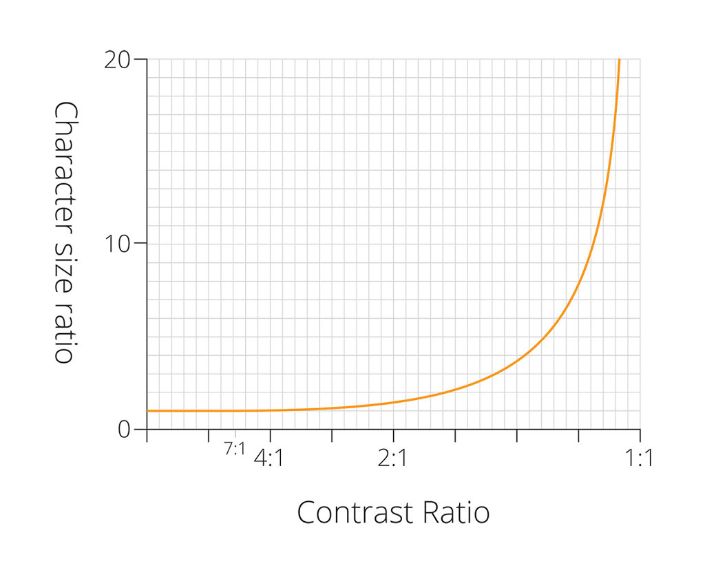
Now imagine a graph where we plot the size a character needs to be to maintain it's level of legibility against its contrast with its background. Thinking about how this model might look, we can see we already have two known points on the graph.
Firstly, according to WCAG, once contrast reaches 1:7 there is no further improvement in legibility. We express 1:7 as 1 divided by 7, or 0.143, so this gives us the start of our graph. To the left of this point (i.e. where contrast is better) it should level out.
Secondly, we might reasonably say that if the size of text has to increase each time contrast decreases, then the other end of the graph must tend towards infinity. To put it another way, once contrast has a ratio of 1:1 (for instance white on white or black on black), the text would have to be infinitely large i.e. it can never be legible at that contrast ratio.
In between I will assume (for want of information to the contrary) that the relationship is a smooth curve. Thinking about these few characteristics, we end up with a graph that looks a bit like this:
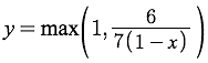
The next logical step is to try and find a mathematical function that will produce a curve that looks like this, so that we can predict the necessary change in text height for any given contrast ratio. To me, that looks a little like a 1 / 1-x function, though if anyone reading is a proper mathematician (or knows one), I would welcome any alternative suggestions. The best-guess function I have at present is...
y=max(1, 6/7(1-x))
Putting it into practice
Having come up with a function that might model the effects of contrast on legibility, it seems sensible to try it out. I have created a sort of legibility testing tool to do this. Feel free to try it out and have a play, although be aware that it is all rather Beta, and probably as likely to break as to work. The font detection relies on Flash, and also won't work if you're using any sort of 'private browsing' mode. It also takes a few seconds to work, so have patience.
Stupidly, I borrowed the font-detection AND the nifty size-calculation scripts from somewhere, and can't remember where. If they're yours please let me know so I can give credit where it's due!
What is it all for?
This tool is designed to combine all of the legibility-related calculations from this blog post and the previous one, and allow a designer to choose any locally-installed font, specify the size, colours, and intended device on which it will be displayed, and see just how legible it might be.
The point of all this is twofold:
To enable designers to make better decisions about typography, for a more readable web experience.
To free designers from the constraints of hard-and-fast contrast rules, so that where branding or aesthetics require type to appear outside of the suggested cut-off points, a judgement call can be made with confidence.
Next steps
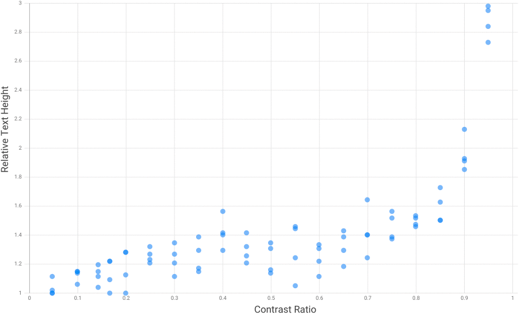
The plan is to test the theory. I've written some testing software that should enable me to test real eyeballs under controlled conditions, and see if the relationship between text size and contrast really does look like this. It may be a little while before a large-scale test can happen (though with help from my awesome colleagues at Zone it shouldn't be too long, I hope), but early signs are good. Here is a chart of results from testing myself and a couple of others in not-very-controlled conditions...
Relative Text Height vs Contrast Ratio
If you found this useful or interesting, or if you know anything about this topic and you don't mind sharing, please add a comment below. Thanks for reading.
This is something I've been trying out recently, and I thought it might be nice to share it and see if anyone else finds it useful. It's still something of a work-in-progress, but I think the approach outlined below has the potential to speed up workflow and communication within this particular bit of the website design / development process.
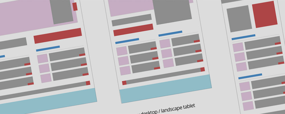
It can be useful to have a simple way to communicate how a web page will be laid out at different screen widths: which bits will grow or shrink, what will sit off the screen, what will be hidden, and so on. This is essentially a diagrammatic approach to the problem of how to communicate that information, as well as a sort of design-aid. It is not a wireframe, as details are deliberately excluded. It is also not a mock-up as the dimensions of objects on the page bear only a loose relation to real life in terms of their relative sizes. It is also fairly useless on its own - it must be read in conjunction with a realistic mock-up of the web page designs in question, depicted at at least one size.
The basic idea is that each website element is represented in a simple block diagram, and colour coded according to broad element types to make it easier for the recipient of the diagram to match these up against a realistic design mock-up. Sizes are only approximate because everything is based on a very large grid to make editing easy.
I think something that makes this approach particularly helpful is its abstraction from reality i.e. the in-built room for manoeuvre that results from not specifying screen widths, and not having exact sizing. There is no particular reason why layout changes have to happen all at once at certain screen widths - after all, break-points are so last week - but it is still important to plan for a good user experience at key screen sizes. How transitions are made, and at what precise screen widths, should probably be dictated by the content in question and doubtless require input from a skilled front-end developer. These diagrams simply show the 'keyframes', if you like.
I have also made a PDF of the same No use as a template, but if you don't have Illustrator at least you can still see what I'm going on about.
I've used these diagrams to plan website behaviour in preparation for front-end build by the quite frankly improbably clever @lnrb0b Perhaps in an ideal world I would mock-up individual page-element behaviour, or sit with my friendly front-end developer and work out how each aspect of the page should reshape itself, but there generally isn't the budget for that. It's still early days, but so far this seems to be quite a good way of roughing out what I'd like to see without adding too many constraints.
Feel free to leave comments below - it would be interesting to know if this is useful to anyone else. And if you think my template is actually about as useful as a brushed-nylon fire-blanket, that I'm completely missing the point, and that I should immediately retrain at my local McDonalds, do please feel free to improve it and re-share!
I hesitated a bit before beginning this blog post for fear that this is actually something that other designers everywhere do all of the time, and I might end up looking like a feckless idiot tapping out egg-sucking instructions for the benefit of no one but the aesthetically deaf. However, as I can't find anyone else talking about this after a full 20 seconds of searching, here goes...
When doing the first visual design for a new website, why not start off in greyscale? That is, design for the final layout and typography, but only using shades of grey.
I first did this quite recently, as a result of inspiration failing to strike in the face of what seemed like the perfect starting point. I'd taken the client through quite a thorough UX analysis and design phase, resulting in a wireframed prototype that seems to be on the money. I had brand guidelines, a good understanding of how the UX requirements should influence the graphic design, and a good feel for what the client and end users would want to see. And yet no matter what I did, I just couldn't seem to get started.
(I don't know if anyone else finds this, but when I'm trying to come up with a new site design, I often find there is a sort of tipping point when the design takes on a life of its own. It's as if the first bit is all uphill, and then suddenly it finds its own direction and you coast down to a completed concept.)
In the end it crossed my mind that the bolder-than-bold corporate colours in the brand guidelines where too distracting, and somehow made 'good' aesthetic decisions harder to make. So I started again with just a greyscale version of the logo in the top left, and began to add the elements specified on the wireframes, but this time only using shades of grey. This seemed to make it easier to focus on the balance of the individual elements on the page, their contrast with each other, and the specifics of the typography. More impact for an individual element might mean a darker grey, or making it bigger, or even a different design. But by not having to worry if I'd picked the right colour from the brand palette I could focus purely on the clarity and balance of the composition.
The outcome was that once I started working this way I very quickly had a completed page mock-up I was happy with, albeit one best suited to hamsters. The next step was obviously to add those missing brand colours, trying out swatches and tints until the colours were talking the same language as the rest of the design.
Unfortunately I can't share the real design work, as the company is big and has put a lot of effort into a rebrand that has yet to launch. But the concept isn't exactly complex, so I doubt anyone needs to see the same design in colour and mono to get the point!
In many ways this is almost a natural progression of the very aesthetically conscientious style of wireframing that I know a lot of UX-ers prefer. I suppose design is like most problem-solving, and if you split one large problem into two smaller ones you have a better chance of getting to the right answer.
So if you find yourself facing a similar problem, and your design is all perspiration and no inspiration, have a go at taking the colour out of the equation - you might be surprised at how much it helps.
Earlier this year I wrote a blog entry for the Auros site about how the UX analysis for a particular project had provided inspiration for the visual design that was to follow. A current project has given me cause to think about this further, and to try to more eloquently explain why I feel that the project stages we generally refer to as 'UX' and 'Design' are in fact just design, and all of the designers involved need to be there for all parts of the process.
At work we recently outsourced the UX component of a particular project, and a few days ago I had a handover from the UX company so that I could start work on the visual design. Usually I handle both bits of the puzzle, and so no kind of handover is required. It made for rather an interesting experience to have been completely separate from the UX analysis and design process, and then receive a set of completed wireframes, approved by the client. I might liken it to starting to watch a movie half an hour in.
What surprised me was how bereft of knowledge I felt. I still understood the client's business, and had a fair idea of what might look good, but all of the subtle nuances of preference that a client normally gives away without even realising were totally absent. I hadn't fully realised until this project just how much of this discretely, subconsciously-delivered information aids my understanding of both what will sit well with the intended users, and what the client will want to see. Without those weeks of to-and-fro with project owners, discussing users and goals and journeys through the site, it felt like I knew both the client and their users less well than I would like to.
It seems rather obvious to say that visual design and user-experience design are simply different stages of the same process, and that really the whole lot is simply DESIGN, and probably would be thought of that way in most industries. But so often I read about them being treated as discrete project elements, handled by different people/teams/companies (delete as appropriate), and that makes me question the way in which many websites are created. The way wireframes describe information and functions on a page has a huge effect on the visual design of a site. The way a graphic designer formats text, images and layouts has a huge effect on a user's experience of a site. So if there is a clear delineation between the two, I don't think I can see it.
And even if we put the influence of visual design on user-experience to one side for a moment; in a commercial setting, the visual designer's judgement call as to what a client will find acceptable can be as important as well-founded user-experience design. The harsh reality is that if you want to get paid, the client has to like your work in the first instance, and not just when or if users report back. And achieving both of those things means knowing your client and knowing what they will like.
I feel like many of the nuances of preference and discrete information that drive delivery of the 'right' design (either from a user-experience or client acceptance point of view), are often implicitly communicated by the client over the course of the UX process. The visual designer / Graphic Designer who is not involved in the design process from the start is missing half the story, and must either do without, or spend time discovering the same things that the UX designer already knows. Likewise without continuity of process from UX analysis through to creation of a visual mock-up or prototype, there can never be a truly thorough realisation of a user-experience designer's vision. Whichever way you look at it, you're wasting time or skills at one end of the process.
