A simple template for planning responsive website behaviour
This is something I've been trying out recently, and I thought it might be nice to share it and see if anyone else finds it useful. It's still something of a work-in-progress, but I think the approach outlined below has the potential to speed up workflow and communication within this particular bit of the website design / development process.
It can be useful to have a simple way to communicate how a web page will be laid out at different screen widths: which bits will grow or shrink, what will sit off the screen, what will be hidden, and so on. This is essentially a diagrammatic approach to the problem of how to communicate that information, as well as a sort of design-aid. It is not a wireframe, as details are deliberately excluded. It is also not a mock-up as the dimensions of objects on the page bear only a loose relation to real life in terms of their relative sizes. It is also fairly useless on its own - it must be read in conjunction with a realistic mock-up of the web page designs in question, depicted at at least one size.
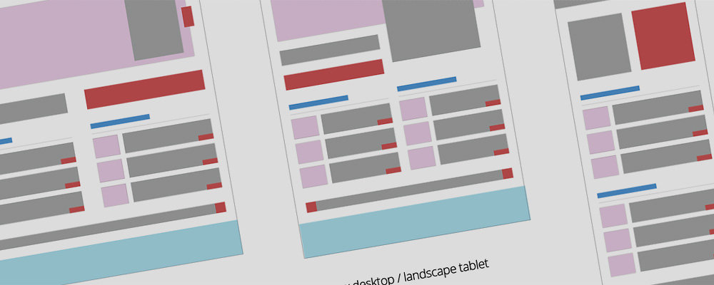
The basic idea is that each website element is represented in a simple block diagram, and colour coded according to broad element types to make it easier for the recipient of the diagram to match these up against a realistic design mock-up. Sizes are only approximate because everything is based on a very large grid to make editing easy.
I think something that makes this approach particularly helpful is its abstraction from reality i.e. the in-built room for manoeuvre that results from not specifying screen widths, and not having exact sizing. There is no particular reason why layout changes have to happen all at once at certain screen widths - after all, break-points are so last week - but it is still important to plan for a good user experience at key screen sizes. How transitions are made, and at what precise screen widths, should probably be dictated by the content in question and doubtless require input from a skilled front-end developer. These diagrams simply show the 'keyframes', if you like.
You can download the template here, suitable for Illustrator CS3+
I have also made a PDF of the same No use as a template, but if you don't have Illustrator at least you can still see what I'm going on about.
I've used these diagrams to plan website behaviour in preparation for front-end build by the quite frankly improbably clever @lnrb0b Perhaps in an ideal world I would mock-up individual page-element behaviour, or sit with my friendly front-end developer and work out how each aspect of the page should reshape itself, but there generally isn't the budget for that. It's still early days, but so far this seems to be quite a good way of roughing out what I'd like to see without adding too many constraints.
Feel free to leave comments below - it would be interesting to know if this is useful to anyone else. And if you think my template is actually about as useful as a brushed-nylon fire-blanket, that I'm completely missing the point, and that I should immediately retrain at my local McDonalds, do please feel free to improve it and re-share!